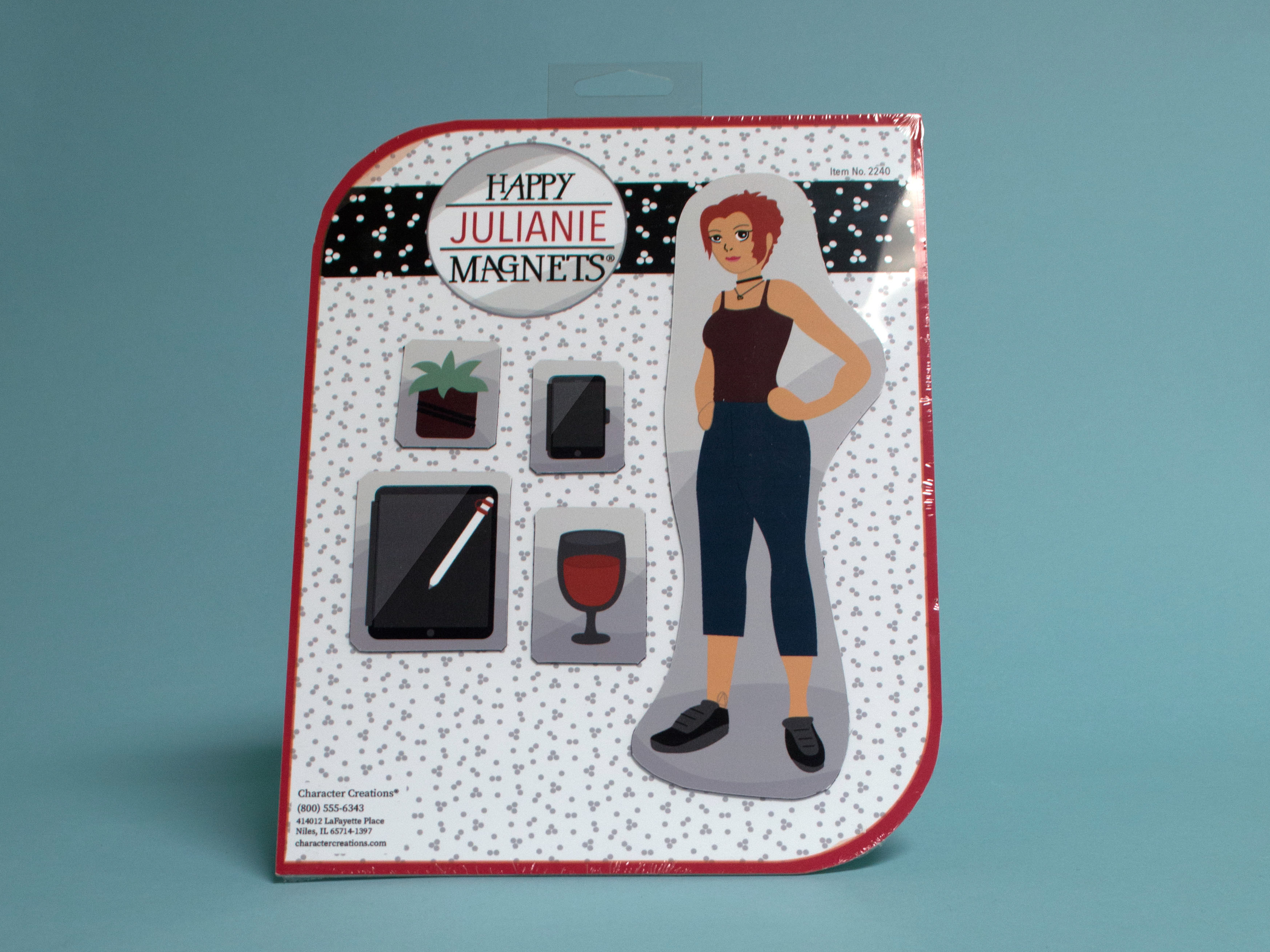
The direction for this package was to create
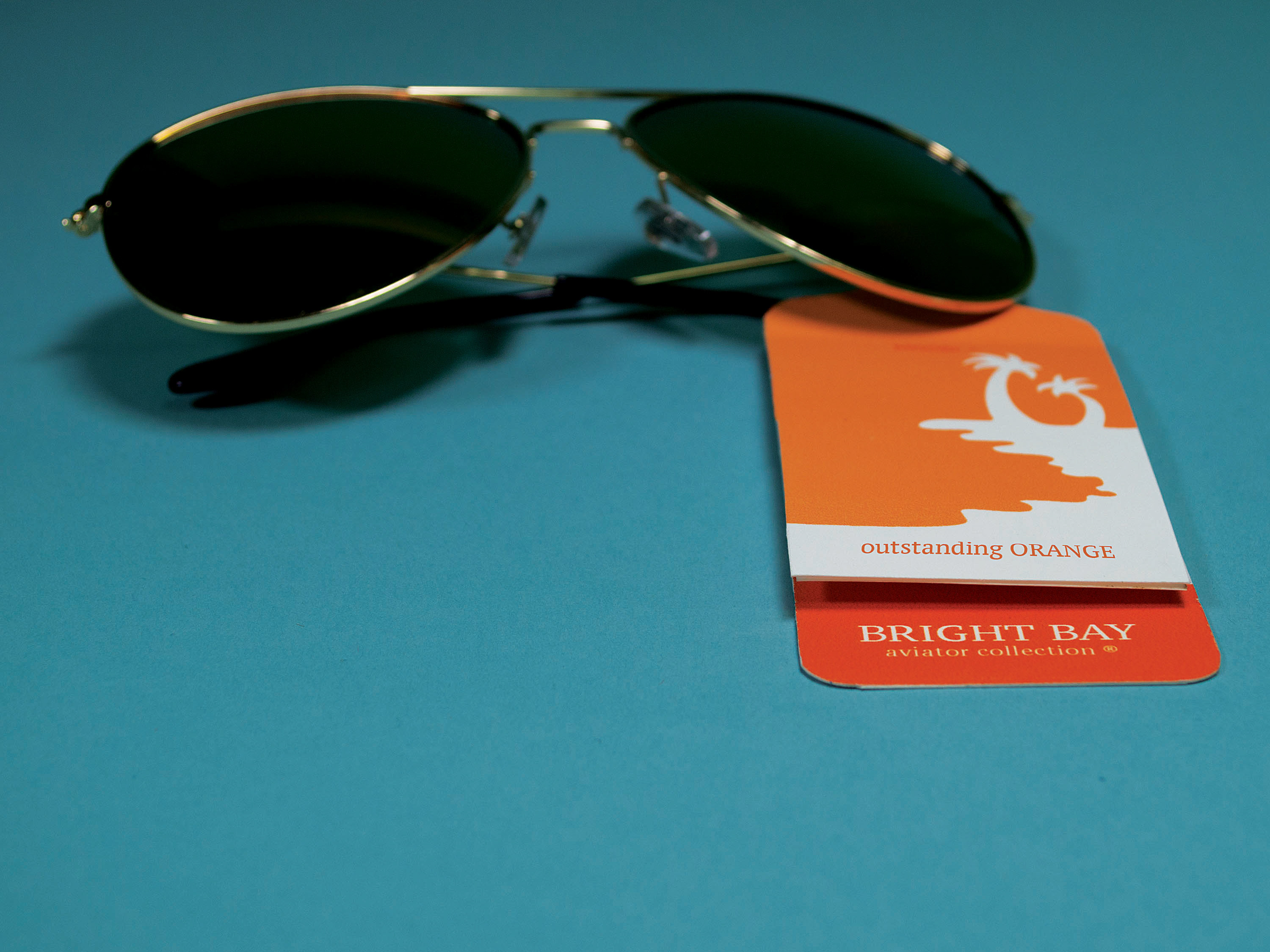
a kitsch package that would show off a mock product inside. The challenge was to make an inexpensive product appear high end and expensive. My strategy was to design a clean and sleek package with the addition of copper foiling in spots. My goal through this project was to shine a light on the necessity to resist using your phone while you are driving.
a kitsch package that would show off a mock product inside. The challenge was to make an inexpensive product appear high end and expensive. My strategy was to design a clean and sleek package with the addition of copper foiling in spots. My goal through this project was to shine a light on the necessity to resist using your phone while you are driving.
